TABLE OF CONTENTS
Precoro Dashboard Overview
Every time you log in to Precoro, the dashboard is there to help you navigate pending documents and stay on top of your tasks. Once you’re ready for more strategic work, like analyzing spend, assessing performance, and planning budgets, navigate to the Analytics section. It gives you a clear and customizable view of data over any selected period, along with tools to dig into the numbers and make informed decisions.
Keep reading to learn about the dashboard features in detail and understand how to make the most of the available tools.
Needs Your Action Section
The top part of the dashboard allows you to access the documents that require your attention right away. Start using it in just two steps:
- Select the tab corresponding to the module you want to work with.
- Click one of the infocards available in the module.
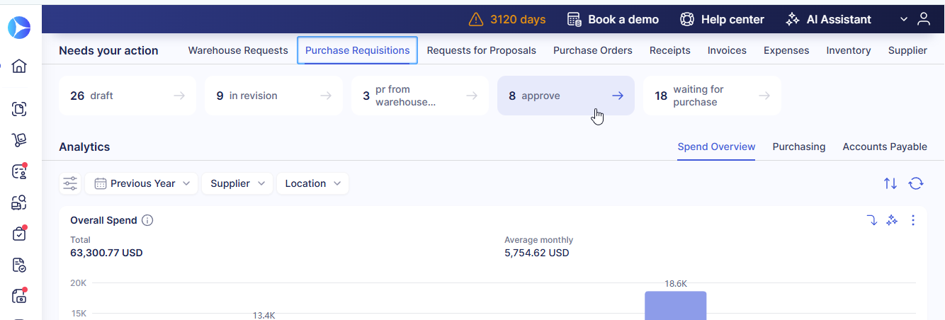
The infocard will open a filtered list of documents, so you won’t have to manually scan the list for what you need to review.
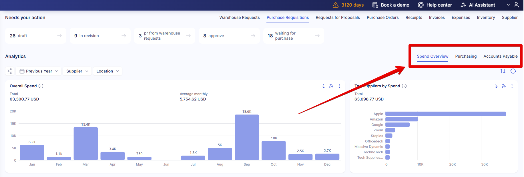
Analytics Section
This section gives you a clear and complete view of your procurement metrics. Keep reading to see what charts are already available and what tools we offer to customize and analyze them.
Tabs and Available Charts
The Analytics section is split into three tabs that provide the main metrics for your operations:
-
Spend Overview—analyze trends, access spend comparisons, and break down the charts to clearly see where the money flows.
-
Purchasing—review and improve the efficiency of your procurement from request to invoice and see if your company consistently stays within the budget.
-
Accounts Payable—make sure that you pay exactly for what you ordered and assess the top invoice creators in your company.
- Approval—analyze approval performance, identify delays, and track how efficiently requests move through the approval process.
The data for the charts is collected from Precoro documents according to your access configuration. If you don’t have access to some of the documents included in the graph’s calculations, your data will be recalculated according to your current permissions. We also account for related documents: when an invoice is added to an order, the invoiced amount is used in the calculation instead of the amount in the PO.
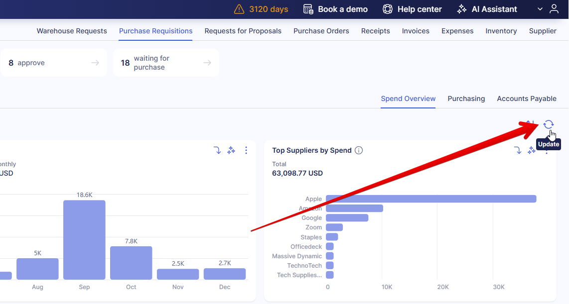
You can hover over bars in any chart to see the precise value.
💡Please note: to populate the charts with the most recent data, click the Update button below the tab selection.
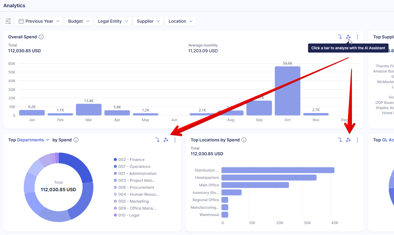
Spend Overview
On the Spend Overview tab, you’ll see the chart representing your overall spend. With full access, the values account for purchase requisitions, orders, invoices, and expenses. You will see the spend calculated based on the enabled modules that you have access to.
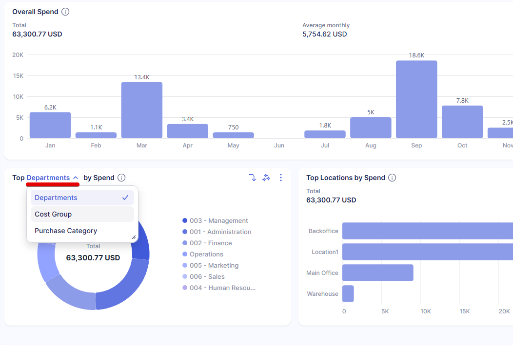
There are also charts that show spend by the top 10 options of different entities. For instance, the Top Suppliers by Spend will show your 10 most popular suppliers along with the amount and percentage of funds your company spends ordering from them.
We also offer these charts for all custom item and document fields. Click the selector in the chart title to choose which custom field you’d like to analyze.
Purchasing
On this tab, you’ll see the graphs that help you understand the correlation between requisitions, orders, invoices, and receipts, track budget usage, as well as measure how efficiently purchasing processes move through each stage. It features the following charts:
- Monthly Requests Value displays the difference between the total requested amount and the total of approved requisitions and gives a quick look at how much you saved by following a consistent approval process.
- Total Spend for Orders shows the total of approved, completed, and closed orders by month.
- Number of Approved Orders can help you assess not just the total value, but the number of separate orders by month.
- Committed vs. Accrued vs. Invoiced shows the total of orders that haven’t been fulfilled yet, the ones that have been received, and the invoiced amount.
- Spend vs. Budget helps you understand which part of each budget was consumed, giving you the foundation to plan future spend and establish rational budget limits. This chart includes a selector that allows you to compare Spend vs. Budget for individual budgets.
- Requisition-to-Order Cycle Time shows how long it takes to move from a confirmed requisition to an approved purchase order, including all approval steps.
- Procure-to-Pay Cycle Time tracks the total time from creating a requisition to processing the final invoice.
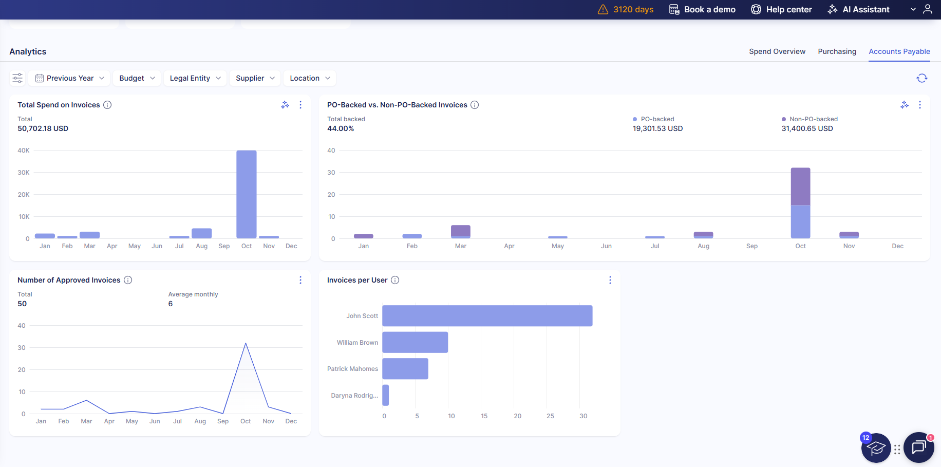
Accounts Payable
This tab gives an insight into the AP team’s work with the following charts:
- Total Spend on Invoices
- PO-Backed vs. Non-PO-Backed Invoices
- Number of Approved Invoices
- Invoices per User (that shows 10 most active invoice creators)
Approval
Use this tab to track approval performance and understand how efficiently requests move through the approval process. It includes the following charts:
- Approval-to-PO Cycle Time
- Request-to-approval cycle time
- Approval-to-Invoice Cycle Time
- Average Approval time per approver
- Approval TAT
- Approval SLA Compliance Rate
Please note that the Approval TAT and Approval SLA Compliance Rate charts are only available if Approval SLA is configured. They are visible to users with these roles: Super User, Configuration, and Admin (full access).
If you’re unsure what each chart represents, hover over the information icon ⓘ for more details.
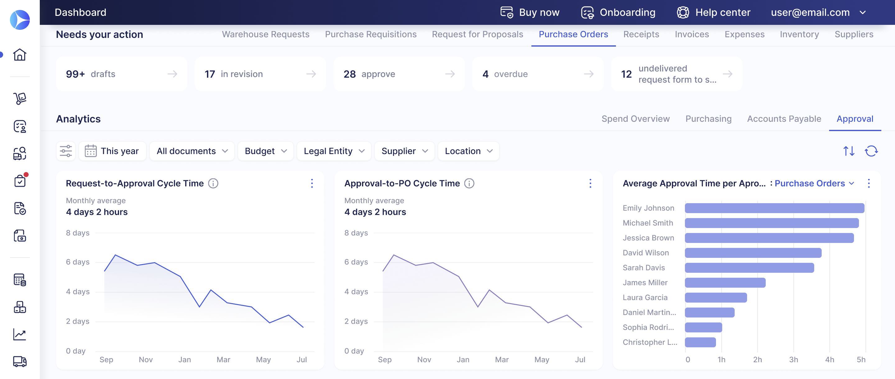
Chart Analysis Tools
The dashboard offers additional tools to focus on the relevant data, explore the patterns in detail, and get answers and suggestions about your operations without hours of manual data processing. Let’s take a look at how to use them.
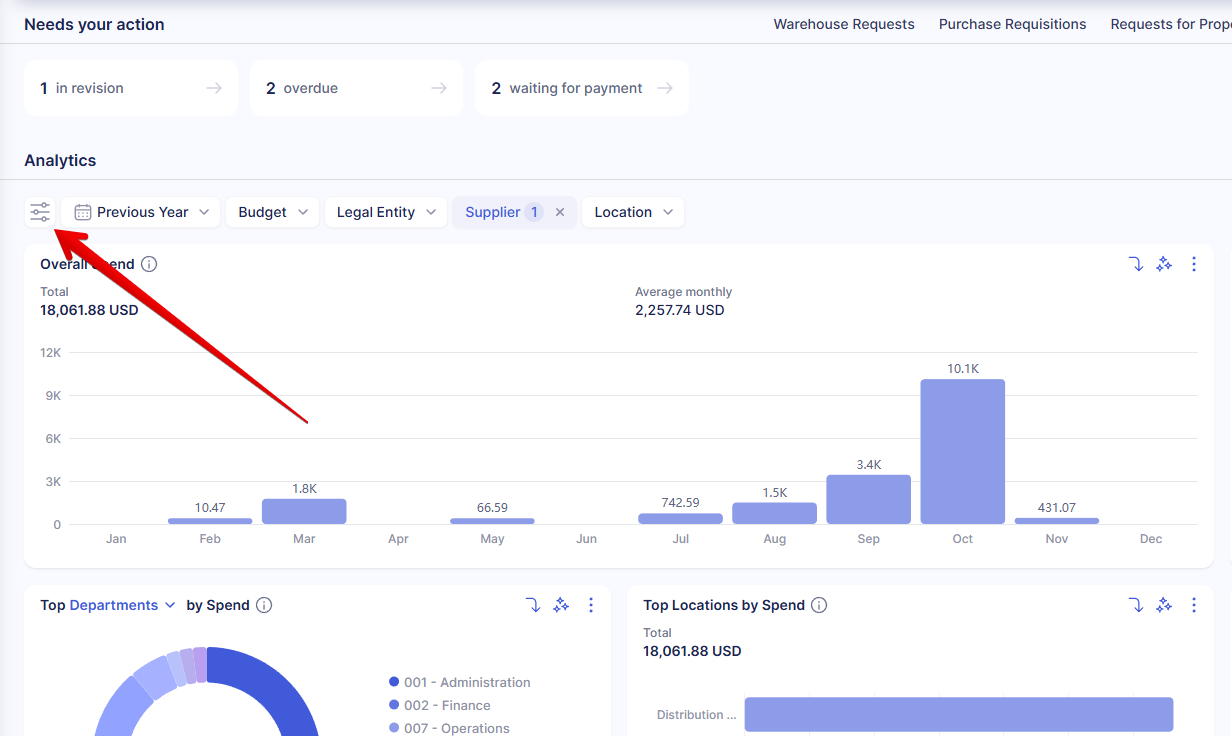
Filters
You can easily customize the dataset used to populate the charts with the filters at the top of the Analytics section. Click on the filter, select the necessary option, and then click on the dashboard to apply it.
Instantly filter by period, supplier, location, budget, and legal entity (if configured in your company). To expand the list of filters and select custom item and document fields, please click the Filters icon at the start of the filter list.
Drill down
If you see the drill-down icon in the top section of the chart, you can click on any bar and select a parameter by which you want to analyze the bar. You’ll see a visual representation of all values that make up the selected bar.
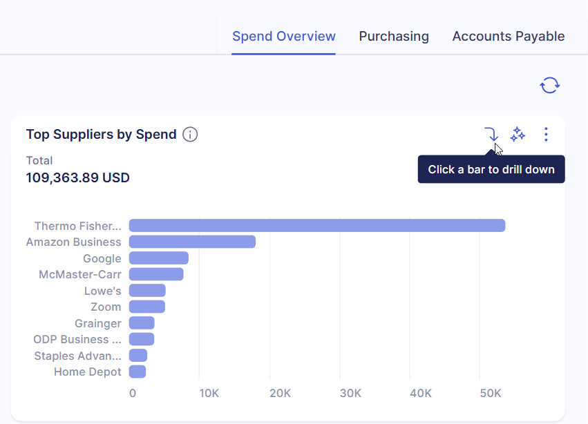
For instance, let's take the Top Suppliers by Spend chart, click on a bar representing a supplier, and drill down by Departments. Once you have the necessary information, click Back to main view to access the original chart.
AI Assistant
If you have the AI Assistant enabled for your company, you can access it from charts with the assistant icon and analyze already filtered data. It’ll help you see deeper into the available information, formulate actionable suggestions on suppliers, business strategy, and possible holdups, and identify potential risks before they escalate.
If you’re yet to get comfortable using the assistant to your advantage, we’ve prepared a list of questions it can help you with here. Following these examples, ask it about the charts to deepen your understanding and gain insight into the provided data.
How Spend Is Calculated in Spend Overview
The Spend Overview dashboard calculates total spend based on active purchasing and payment documents. To ensure accurate reporting and prevent duplicate values, only specific document types and statuses are included in calculations.
Documents Included in Spend Overview
| Document Type | Included Statuses |
| Purchase Requisitions (including those created from Warehouse Requests) | Approved, Completed |
| Purchase Orders | Approved, Completed |
| Service Orders | Approved, Completed |
| Invoices (including those created from Blanket POs) | Approved |
| Expenses | Approved |
Please note:
- Documents in Draft, Rejected, or Canceled status are not included in Spend Overview.
- Warehouse Requests, Blanket Purchase Orders, and Receipts are never included in spend calculations.
How Double-Counting Is Prevented
To avoid duplicate spend values, Precoro automatically adjusts calculations when related documents are created from one another.
For example, A PO for $100 reaches Approved status → $100 appears in Spend Overview.
An Invoice is created against this PO and moves to Pending → $100 disappears from the dashboard. The Invoice reaches Approved status → $100 appears in Spend Overview again.
Below are the document statuses that remove the related document's amount from the dashboard:
| Document | Excluded When Status Is |
| PO from PR | Pending, Rejected, Matching, In Revision, Approval Review |
| Service Order from PR | Pending, Rejected, Matching, In Revision, Approval Review |
| Invoice created from PO | Pending, Matching, In Revision, Approval Review, Pending Receipt |
| Invoice created from Service Order | Pending, Matching, In Revision, Approval Review, Pending Receipt |
| Invoice created from Blanket PO | In Revision, Canceled |
| Credit Note created from Invoice | Paid |
| Credit Note without Invoice | Paid |